One hundred and for almost twenty years ago, some Hans Jedlitschka, or simply Jedlička, published simultaneously in Vienna and Leipzig, map in German Der praktische Schildermaler (The Practical Sign Painter), which is a folder of 64 free cromolytic sheets of templates for advertising boards intended for sign painters. So their purpose was to help those professionals, that does not exist anymore, maybe even somebody of you never heard of them, and their work is inherited - though many among us are not aware of it - by graphic designers!
Der Praktische Schildermaler - vintage logo design
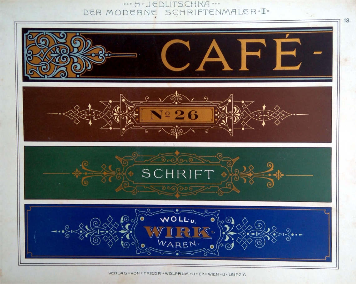
The shops of that time, as well as many of the richer residences, had two sets of entrance doors: one so-called daily and other nocturnal. Daily doors had windows to let the sunhine and illuminate the space, and the nocturnal doors were made full of massive woods with the main task of preventing entry to the uninvited, and were often decorative and adorned with woods. The showcases themselves had wooden shutters, which were locked at night, while they opened by day, folded and attached to the wall. It would be a shame not to use them for advertising labels and similar useful things. That is why on the inside of these shutters were usually painted, and this work was done by the sign painters! This is the reason why the templates in the Jedlička map are mostly high and narrow: they were intended for those winged shutters that protected showcases from the burglary at night.
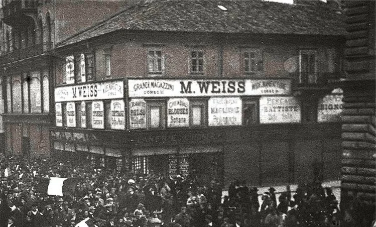
Vintage advertising signs - Rijeka Croatia
On the floors above the shop, again, the boards with advertising signs were gladly placed in the spaces between the windows. These spaces had the advantage that they were never closed, so the ads were always visible. Clearly, their shape was somewhat different - they were relatively broader and far lower - so the final result was to separately compose and adjust to the default dimensions.
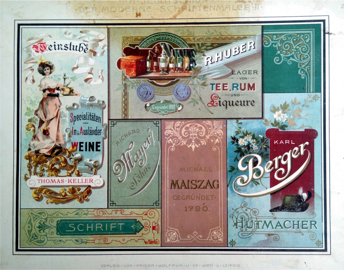
Logos at the time did not really differ much from today. They did, as a rule, have the name printed in a specially chosen font of carefully selected colors, which sometimes followed a simple drawing, mostly in the function of a trademark.
Advertising sign - Der praktische Schildermaler
The work of the sign painter was never an easy one. After those shutters were straightened by carpenter and fundamentally painted and polished, sign painter will with paper sketches take the contours, most commonly with the toothed iron roll, similar to those of tailors for transferring the patterns to the shutters. This wheel made the holes on the paper so that through the holes it could be applied charcoal dust with a soft cotton cushion and thus obtained the sketches on the base, that is, the wings of the shutters. Next, the job was fairly straightforward because after a successful preselection of fonts and colors, the result was mostly based on quality brushes that receive a lot of color and do not change the thickness of the line in the move and, of course, the drawing or painting skill of the sign painter.
Der praktische Schildermaler - advertising logo design
Today, technology is quite different: the template is "drawn" on the computer, and "printed" on a suitable printer to a suitable media which is then "applied" appropriately. Therefore, as all this process takes place virtually, without any need to physically create anything and risk to destroy your job through some changes, the job today has become not only significantly cheaper but also simpler because the act of the final "physical activity" is postponed until the moment in which "everything is finally perfect" and when we are satisfied with the final result.
At the time when the master sign painter was copied selected template as already mentioned or enlarged it, usually by using the grid, so manually copying and compiling his logos or advertisements, any mistake in the steps meant actually the beginning of his work from scratch.
Today, the job is often reduced to finding a suitable genre of photos on a free-stock-site or even a mock-up where you will load your logo and generate the selected scene. It's relatively easy to translate it in drawing.
Of course, here I deliberately skip that tedious part of composing logs and achieving the desired harmony of the composition that relies on the most our energy and time. I wanted to emphasize that today this technical aspect of drawing and composing, choosing a suitable line, a suitable color tint and so forth, is considerably facilitated by the fact that much of the changes can be done on the go, unlike the time when everything had to be carefully planned to the detail in the first place because subsequently, little could be changed or refined to prevent it from harming a final outcome.
Above-mentioned Jedlička map of the templates, has become today a subject of antiquary and book lovers interest, even object of trade and investment as rare specimens when a quick sale of 2000 euro pieces is emerging. And the sheets of this map have, perhaps accidentally, acquired the seductive "status of sanctity" of the vintage graphics, for which almost everyone in the encounter wished to frame them and put them in displey on the wall.
But meeting with these templates, letting the question of stylistic commitment, or the question of whether your logo inspired by them gets a "secessionist spirit" or not, is certainly another important question: do you have anything to say with your logo or not.


