• HIGHLIGHTED DESIGN WORK / IZDVOJENI LOGO DIZAJNI
  • My logo design work / Izrada logotipa portfolio
  • Premade logos gallery / Kupi gotov logotip
  • Lion and lion crests logo designs / Izrada logotipa s prikazom lava
  • Recent Logo Design Collection / Kolekcija logo dizajna - nedavna izrada
  • Design and production of various flags and gonfanons / Izrada i dizajn zastava i gonfalona
  • Products and designs made for medieval castle in Bribir, Croatia
  • Souvenirs and promotional material / Suveniri i promotivni materijal
  • Random sparks blog / Slučajne iskrice
  • About
  • Contact

Crest logo design / Dizajn i izrada logotipa

by Veronika Zuvic

  • HIGHLIGHTED DESIGN WORK / IZDVOJENI LOGO DIZAJNI
  • My logo design work / Izrada logotipa portfolio
  • Premade logos gallery / Kupi gotov logotip
  • Lion and lion crests logo designs / Izrada logotipa s prikazom lava
  • Recent Logo Design Collection / Kolekcija logo dizajna - nedavna izrada
  • Design and production of various flags and gonfanons / Izrada i dizajn zastava i gonfalona
  • Products and designs made for medieval castle in Bribir, Croatia
  • Souvenirs and promotional material / Suveniri i promotivni materijal
  • Random sparks blog / Slučajne iskrice
  • About
  • Contact

Dizajn logotipa - nekad i sad

Prije stotinu i sada već gotovo dvadeset godina neki Hans Jedlitschka, ili naprosto Jedlička, objavio je istodobno u Beču i Leipzigu na njemačkom Der praktische Schildermaler (The Practical SignPainter), što je mapa sa 64 slobodna kromolitografirana lista predložaka za reklamne panoe namijenjena pismoslikarima. Dakle svrha im je bila pomoći profesiji koja danas više ne postoji, poneko možda nije ni čuo za njih, a njihov posao naslijedili su, mada ni toga mnogi nisu svjesni - grafički dizajneri!

186.jpg

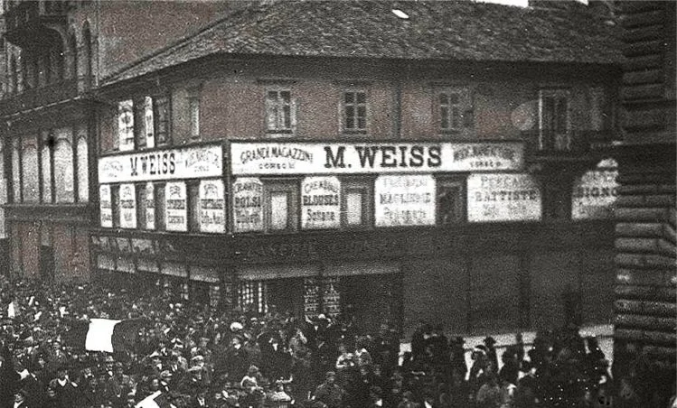
Dućani onoga doba, kao i mnoge bogatije kuće za stanovanje, imali po dva seta ulaznih vrata: jedna tzv. dnevna i druga noćna. Ona dnevna imala su na sebi prozore kako bi kroz njih ulazila svjetlost sunca i osvjetljavala prostor, a noćna su pak bila od punog, masivnog drveta s glavnom zadaćom da spriječe ulaz uljezima, nerijetko su još bila dekorativna i ukrašena duborezima. I sami izlozi imali su drvene zaštitne prozore ili škure (sjenila?) koje su po noći bile zatvarane, dok su se po danu rasklapale i slagale pričvršćene uza zid. Bila bi prava šteta ne iskoristiti ih za reklamne natpise i tome slične korisne stvari. Zato su nutarnje strane ovih škura u pravilu bile oslikane, a taj posao odrađivali su pismoslikari! To je i razlog zašto su predlošci u Jedličkinoj mapi mahom visoki i uski: namijenjeni su bili tim krilima škura koja su noću štitila od provala.

Vintage store with logos

Na katovima iznad dućana su, opet, ploče s reklamnim natpisima rado stavljali u prostore između prozora. Ti prostori imali imali su prednost da se nikad ne zatvaraju, pa su reklame uvijek vidljive. Jasno, oblik im je bio nešto drugačiji - bile su relativno šire dosta niže - pa je konačni rezultat trebalo zasebno komponirati i prilagođavati zadanim gabaritma.

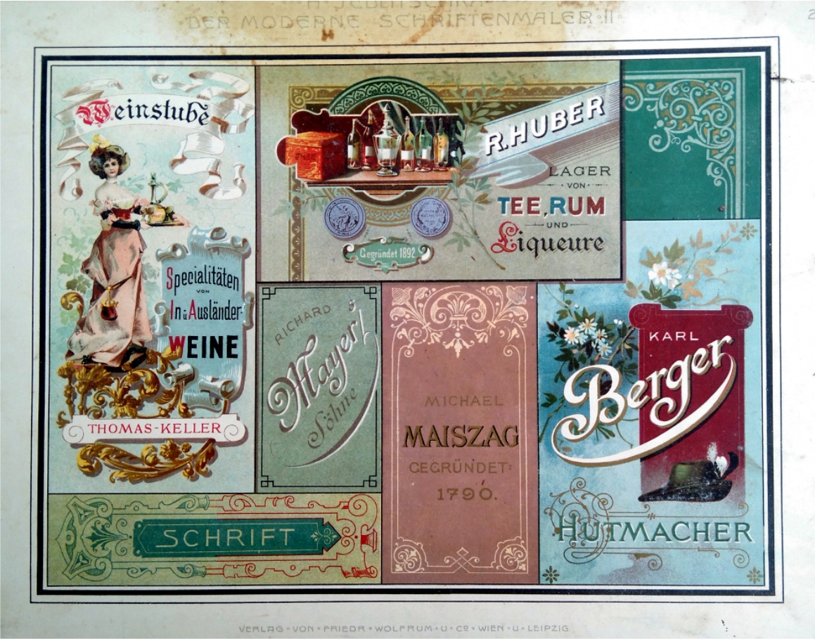
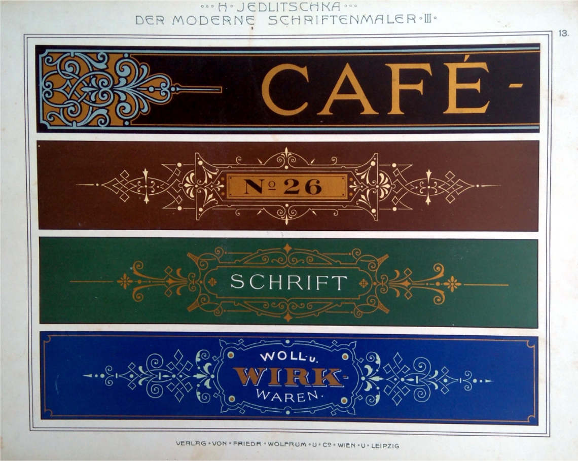
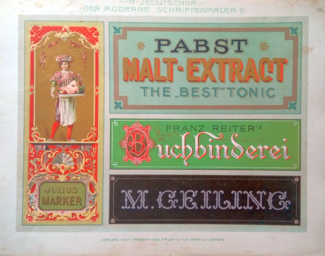
Logoi se tada principjelno nisu mnogo razlikovali od današnjih. Činio ih je u pravilu naziv ispisan u posebno izabranom fontu pomno izabrane boje, što je ponekad pratio jednostavan crtež, uglavnom u funkciji trgovačkog znaka (trade mark).

Vintage logos

Posao pismoslikara bio sve samo ne lagan. Nakon što su spomenuta krila bila stolarski uređena i temeljno polakirana, s papirne su skice ili predloška "skidane" konture crteža, najčešće pomoću nazubljenog željeznog kotačića, kakve su imali i krojači za prenošenje krojeva na tkanine. Taj kotačić pravio je rupe na papiru, pa se kroz te rupe moglo pomoću mekog "tufera" nanijeti ugljeni prah i tako dobiti konture crteža na podlozi, tj. krilu onih škura. Dalje je posao bio prilično jednostavan (straight-forward), jer je nakon uspjelog izbora fonta i boja, rezultat ovisio ponajviše o kvalitetnim kistovima, koji primaju puno boje i ne mijenjaju debljinu linije u potezu, te naravno, o crtačkom ili slikarskom daru samog pismoslikara.

Danas je tehnologija posve drugačija: predložak se "crta" (izrađuje) na kompjuteru, pa "printa" na prikladnom printeru na prikladan medij koji se potom "aplicira" na prikladan način. Stoga, što se sav ovaj proces odvija virtualno, bez bilo kakve potrebe da se fizički bilo što doista izrađuje, pa onda i potencijalno upropaštava kroz pojedine promjene u izvedbi, posao je postao ne samo bitno jeftiniji, već i jednostavniji, jer je akt konačne "fizičke djelatnosti" odgođen do trenutka kad je sve "konačno sjelo" i kad smo zadovoljni konačnim rezultatom.

A nekada, dok je majstor pismoslikar odabrani predložak precrtavao kako je već spomenuto ili ga uvećavao, obično pomoću mreže, pa tako ručno preslikavao i komponirao svoje logoe i reklame, svaka greška u koracima značila je zapravo početak rada iznova.

Vintage logos and crests

Danas se posao nerijetko svodi na traženje prikladne žanr fotke na nekom besplatnom sajtu ili čak mock-upa u koji ćete učitati svoj logo i generirati odabranu scenu. Nju je već lako precrtati.

Naravno, ovdje namjerno preskačem onaj mukotrpni dio komponiranja loga i postizanja željenog sklada kompozicije koji odnosi najviše energije i vremena. Željela sam naglasiti kako je danas taj tehnički aspekt crtanja i komponiranja, odabira prikladne linije, prikladnog tona boje i slično bitno olakšan činjenicom da mnogo toga može mijenjati u hodu, za razliku od doba kad je sve prvo trebalo pažljivo isplanirati do u detalje, jer se naknadno malo toga moglo mijenjati ili dotjerivati a da to ne bude nauštrb konačnog rezultata.

Danas je ona na početku spomenuta Jedličkina mapa predložaka postala više predmet antikvarnog i knjižnog interesa, čak trgovine i investicije, jer se rijetki primjerci kad se pojave brzo prodaju po 2000 eura komad. A listovi ove mape postigli su, možda i nehtijući, onaj zavodnički "status svetosti" starih grafika zbog koga ih gotovo svako u susretu s njima ih poželi uokviriti i staviti na zid.


tags: vintage logos, stari logotipi, izrada logotipa nekad, pismoslikari, grafički ditajn, grafički dizajner, logotipi s početka stoljeća, tipografija, uređenje izloga, kromolitografija, tradicionalan dizajn, stare reklame, stari reklamni panoi
Monday 09.17.18
Posted by Veronika Žuvić
 

Vintage logo design and today's

One hundred and for almost twenty years ago, some Hans Jedlitschka, or simply Jedlička, published simultaneously in Vienna and Leipzig, map in German Der praktische Schildermaler (The Practical Sign Painter), which is a folder of 64 free cromolytic sheets of templates for advertising boards intended for sign painters. So their purpose was to help those professionals, that does not exist anymore, maybe even somebody of you never heard of them, and their work is inherited - though many among us are not aware of it - by graphic designers!

Der Praktische Schildermaler - vintage logo design

Der Praktische Schildermaler - vintage logo design

The shops of that time, as well as many of the richer residences, had two sets of entrance doors: one so-called daily and other nocturnal. Daily doors had windows to let the sunhine and illuminate the space, and the nocturnal doors were made full of massive woods with the main task of preventing entry to the uninvited, and were often decorative and adorned with woods. The showcases themselves had wooden shutters, which were locked at night, while they opened by day, folded and attached to the wall. It would be a shame not to use them for advertising labels and similar useful things. That is why on the inside of these shutters were usually painted, and this work was done by the sign painters! This is the reason why the templates in the Jedlička map are mostly high and narrow: they were intended for those winged shutters that protected showcases from the burglary at night.

Vintage advertising signs - Rijeka Croatia

Vintage advertising signs - Rijeka Croatia

On the floors above the shop, again, the boards with advertising signs were gladly placed in the spaces between the windows. These spaces had the advantage that they were never closed, so the ads were always visible. Clearly, their shape was somewhat different - they were relatively broader and far lower - so the final result was to separately compose and adjust to the default dimensions.

Logos at the time did not really differ much from today. They did, as a rule, have the name printed in a specially chosen font of carefully selected colors, which sometimes followed a simple drawing, mostly in the function of a trademark.

Advertising sign - Der praktische Schildermaler

Advertising sign - Der praktische Schildermaler

The work of the sign painter was never an easy one. After those shutters were straightened by carpenter and fundamentally painted and polished, sign painter will with paper sketches take the contours, most commonly with the toothed iron roll, similar to those of tailors for transferring the patterns to the shutters. This wheel made the holes on the paper so that through the holes it could be applied charcoal dust with a soft cotton cushion and thus obtained the sketches on the base, that is, the wings of the shutters. Next, the job was fairly straightforward because after a successful preselection of fonts and colors, the result was mostly based on quality brushes that receive a lot of color and do not change the thickness of the line in the move and, of course, the drawing or painting skill of the sign painter.

Der praktische Schildermaler - advertising logo design

Der praktische Schildermaler - advertising logo design

Today, technology is quite different: the template is "drawn" on the computer, and "printed" on a suitable printer to a suitable media which is then "applied" appropriately. Therefore, as all this process takes place virtually, without any need to physically create anything and risk to destroy your job through some changes, the job today has become not only significantly cheaper but also simpler because the act of the final "physical activity" is postponed until the moment in which "everything is finally perfect" and when we are satisfied with the final result.

At the time when the master sign painter was copied selected template as already mentioned or enlarged it, usually by using the grid, so manually copying and compiling his logos or advertisements, any mistake in the steps meant actually the beginning of his work from scratch.

Today, the job is often reduced to finding a suitable genre of photos on a free-stock-site or even a mock-up where you will load your logo and generate the selected scene. It's relatively easy to translate it in drawing.

Of course, here I deliberately skip that tedious part of composing logs and achieving the desired harmony of the composition that relies on the most our energy and time. I wanted to emphasize that today this technical aspect of drawing and composing, choosing a suitable line, a suitable color tint and so forth, is considerably facilitated by the fact that much of the changes can be done on the go, unlike the time when everything had to be carefully planned to the detail in the first place because subsequently, little could be changed or refined to prevent it from harming a final outcome.

Above-mentioned Jedlička map of the templates, has become today a subject of antiquary and book lovers interest, even object of trade and investment as rare specimens when a quick sale of 2000 euro pieces is emerging. And the sheets of this map have, perhaps accidentally, acquired the seductive "status of sanctity" of the vintage graphics, for which almost everyone in the encounter wished to frame them and put them in displey on the wall.

Vintage letter logos

But meeting with these templates, letting the question of stylistic commitment, or the question of whether your logo inspired by them gets a "secessionist spirit" or not, is certainly another important question: do you have anything to say with your logo or not.

tags: vintage logo, vintage logo design, advertising signs, Hans Jedlitschka, last century graphic design, jugendstil design, vintage signs, vintage marketing signs, vintage marketing logos, vintage graphic design, seccesion, logo design blog
Monday 09.03.18
Posted by Veronika Žuvić
 

Unicorn and panther in logo design and its origins in crests

In my logo design work I mostly enjoy to design fantastic creatures and animals which can be found in coats of arms, popularly called crests. In this article I decided to represent two fantastic creatures in logo design: unicorn and heraldic panther.

Although lion and eagle are the most popular animals in logo design, there are some other very interested creatures that you meet not so much, some of them in fact very rarely, because unfortunately the knowledge of their existence is somehow lost in collective memory.

PANTHER

One of them is heraldic panther, which can be found in logos, but mostly just as an modernized mark of an county or city traditionally using panthers in their crests. Unicorn is used more often in the logos, but both of these animals are mostly lost their original visual characteristics and attributes still found in classical heraldry.
Namely, both of these animals are represented differently from natural horses and panthers.

But to see very interesting particulars in their design, one needs to dive in history and the most popular books of the middle Ages according to  Bible - medieval bestiaries. Medieval Bestiaries all have their origins in ancient collection of stories named Physiologos, namely, descriptions and didactic stories dealing with animals, fantastic creatures, herbs, even  inanimate objects, often with moral content.  Those stories are spread across the Europe during middle Ages and they are often mix of  Christianity believes, fantastic stories and facts about the natural world which medieval people believed to be true.
(For example, they believed swift has no legs because it can't be seen on the ground, it seems like it always fly! That's why in heraldry swift is always shown without legs.)

Panther is represented as a magical creature in bestiaries. It is an animal with very pleasant sweet breath that attracts all other animals to approach to it. All but dragon who hates panther and is always hiding from it. After eating, panther sleeps for three days and when it wakes up it roars and its sweet breath is coming from its mouth so other animals are approaching it again.

http://www.enciklopedija.hr/natuknica.aspx?id=7287#top

http://www.enciklopedija.hr/natuknica.aspx?id=7287#top

Panther is symbol of Christ and  resurrection in this story, and dragon is obviously a devil who hides from Christ. Sometimes in art, but especially in heraldry, panther isn't similar to natural one. It has a long neck, long ears, a head sometimes reminds on a horse head, and it has a body similar to other heraldic beasts.

Heraldic panther in town of Cres coat pf arms and in coats of arms of Hermolais noble family. Drawings by Mladen Stojić, Heraldic art d.o.o., Rijeka, Croatia. 

Heraldic panther in town of Cres coat pf arms and in coats of arms of Hermolais noble family. Drawings by Mladen Stojić, Heraldic art d.o.o., Rijeka, Croatia.


Panther is often shown having (colored) spots on its body representing its pleasant smell.

Left: Panther with spots on ancient mosaic. Source: https://www.flickr.com/photos/eusebius/4651062946/ Photo by Eusebius@CommonRight: Heraldic panther badge of Henry VI, shown with colored spots on its body. Source: https://commons.wikimedia.org/wik…

Left: Panther with spots on ancient mosaic. Source: https://www.flickr.com/photos/eusebius/4651062946/ Photo by Eusebius@Common

Right: Heraldic panther badge of Henry VI, shown with colored spots on its body. Source: https://commons.wikimedia.org/wiki/File:Panther_Badge_of_Henry_VI.svg Design by Sodacan

Eventually, its breath is started to be represented as fire in some heraldic drawings of the panther. At first, fire was coming out just from its mouth, but later from all wholes of its body. The most famous example is panther in Styrian coat of arms.

Styrian panther on fassade in Graz. Source: https://commons.wikimedia.org/wiki/File:Graz_Zeughaus_Portal_Wappen_Panther.jpg Photo by: Andreas Praefcke

Styrian panther on fassade in Graz. Source: https://commons.wikimedia.org/wiki/File:Graz_Zeughaus_Portal_Wappen_Panther.jpg Photo by: Andreas Praefcke

Panthers in logos today mostly don't have anything similar to panthers from bestiaries and heraldic panthers. They are mostly similar to natural ones and the memory on fantastic beast is somehow lost. I am sorry for that because I am still waiting for a client willing to purchase heraldic panther logo!

Logo for a soccer club by Veronika Žuvić

Logo for a soccer club by Veronika Žuvić

Heraldic panther as a logo of Hypo Steiermark Bank Source: https://www.webgeek.club/hypo-steiermark-logo.html Designer unknown?

Heraldic panther as a logo of Hypo Steiermark Bank Source: https://www.webgeek.club/hypo-steiermark-logo.html Designer unknown?

UNICORN

Just like panther, unicorn is also a beast from bestiaries, which, like story says, can be caught only by the virgin. Unicorn is often shown in medieval and  Renaissance art posing its head on her lap.

Virgin with unicorn. Source: https://en.wikipedia.org/wiki/Unicorn#/media/File:Wildweibchen_mit_Einhorn.jpg

Virgin with unicorn. Source: https://en.wikipedia.org/wiki/Unicorn#/media/File:Wildweibchen_mit_Einhorn.jpg

Unicorn is also different in its visual representation and most often it doesn't look like a horse. Except the horn, it has thinner body, rich fur and it doesn't have hoof but hoop.

Today, in logo design it is very rare to find a real heraldic unicorn. For most clients it is rather acceptable unicorn to be shown as a natural horse - just with a horn on its head.

Two unicorn logos designed by Veronika Žuvić. On the left is heraldic unicorn logo. Logo on the right is closer to natural horse, just with horn on its head.

Two unicorn logos designed by Veronika Žuvić. On the left is heraldic unicorn logo. Logo on the right is closer to natural horse, just with horn on its head.

I have also seen winged and horned horse logo designs which doesn't make any sence because a creature can be an unicorn or Pegasus,but not something in the middle!

With this article I just wanted to remind you of some forgotten symbols that can be shown in logos again, in modern fresh look, but nevertheless founded in heraldry and ever more forgotten sources.


tags: panther logo, shield panther, panther heraldry, heraldic panther, heraldic logo, logo crest, unicorn crest, unicorn logo, unicorn logo crest, heraldry unicorn, medieval heraldry, unicorn shield logo, unicorn crest logo, middle age heraldry, modern heraldry, unicorn logo origins, panther logo origins, panther design, unicorn logo design
Wednesday 08.22.18
Posted by Veronika Žuvić
 

Vodič za izradu logotipa: cijena, gdje, tko i kako?

Kakav je raspon cijena za izradu logotipa i gdje se sve mogu potražiti usluge izrade logotipa.

Kakav je raspon cijena za izradu logotipa i gdje se sve mogu potražiti usluge izrade logotipa.

Kakvi tipovi usluga izrade logotipa postoje na internetu i uopće te otprilike po kojim cijenama se te usluge nude.

Read more

tags: izrada logotipa cijena, gdje naručiti logotip, besplatan logotip, logo za firmu, izrada poslovnih logotipa, logo za tvrtku, dizajn logotipa cijena, dizajner logotipa cijena, logo za obrt, logo za mele firme, koliko košta izrada logotipa, logo dizjan blog
Thursday 08.16.18
Posted by Veronika Žuvić
 

My experience with Logoground site - a place for buying and selling premade logos

In this post I am describing my experience positive with Logoground site as a logo designer and in the logo seller role. What differences this site from the similar others?

Read more

tags: logo designer experience, logo dizajner, logo dizajner iskustvo, ready-made logo design, ready made logos, logoground, premade logos, premade logo desig, logos for sale, grafički dizajner iskustva, zarada na internetu grafički dizajn, zarada logo dizajn, where to sell logos, logo design blog
Monday 08.13.18
Posted by Veronika Žuvić
 

Could you design me an...

In this article I am explaining the difference between logo design and coat of arms design, generally called crests. What troubles cause these terms in common use?

Read more

tags: izrada logotipa, izrada grba, izrada amblema, coat of arms, logo design, heraldry, heraldika, logo and graphic design, logo dizajner, crest, logo shield, heraldic logo, logo crest, logo design blog
Wednesday 08.08.18
Posted by Veronika Žuvić
 

Crest logo design / Izrada logotipa by Veronika Žuvić